
Heres a couple of things I've been doing at work.
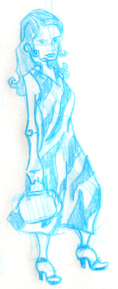
The girl in the zebra print is for the Women's Department, with the theme of "Grace Gone Wild". I've got people wanting something very refined and classy, then I have people wanting something crazy and wild. So the first part is going to be the fashion scene with wild animal prints. The second part I'll post some other time once I've got some drawings for it.
This is going to be on the cover of an annual type of report done up real classy like!
4 comments:
Jeremy, these are great. The logo works well with the background. Very sophisticated looking. The zebra-girl is interesting too.. I think her hand on the purse is a little awkward. awesome :-)
I really like how the logo turned out. I think it is awsome. I like zadra girls out fix turned out too. But she should be asame of her self kill a zabre for that outfit. :-)
I'd say be careful about sharp angles when it comes to women. I notice a fair bit of pointyness on her, which is usually a more masculine trait. It's a pretty solid piece though, nice work! :)
I'm really diggin the logo man. Nice color palette, clean, legible design and a lot of fun. Right on!
Jeremy you have come a long way my friend! These are looking GREAT. There are a few things that I see could use improvement though.
First off the LOGO! This is lookin great, I do agree with what everyone else said about it but one thing that still bothers me is the lettering. I think your trying to keep it to a single color but I think you could go lighter on the words. That wouold make it "POP" a bit more and make it stand out as the Focus of the piece.
The fine lookin lady is Great! The sharp angles don't bother me as much as Jason. The art kind of reminds me of Alberto at www.bellefree.com. Look em up...there are quite a few of sweet artist over there. there are however a few things that my eye keeps having trouble with. One being the dress needs some definition, meaning it looks a little flat (one thing that could help it would be to show the back side of the dress behind the legs to show that the legs actually go into the dress. Two would be to give some definition between the dress and purse. and for crying out loud why is there a BROWN handle one a BLACK and WHITE purse....Gosh I thought everyone knew that BLACK and BROWN are a fasion NO NO! hehehe Sweet design...keep it up man...and if this is to be a fasion design think of some more accessiories ie. braclet, anklet, earings, necklace Bow and Arrow....you know the usual. ;)
Post a Comment