
Just some random thing. it started off as an Icarus type of idea, then the wings morphed into a cape with fun shoulder dealies.
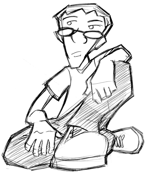
I wanted a new blogger pic, so I drew a self portrait pretty quick. I'm growing sideburns now, they are much more pitiful in real life.
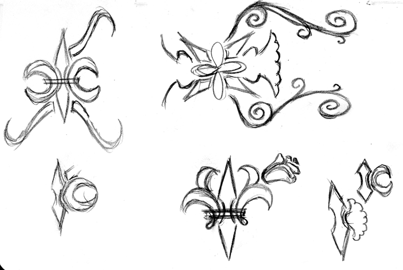
These last three images are icon ideas I have for Jeremy's website. Feedback is welcome from everyone, but the person I really need to hear from is, of course, Jeremy. What do you think man? Headed in the right direction? Any of these appeal? I know a lot of them aren't finished, I was just batting around ideas and some didn't make it all the way.

You'll notice a lot of these are asymmetrical, at least as they are. It would be my intention to just copy>paste>reflect the vector stuff, so there's not much point in trying to get it symmetrical in the drawing stage. I should ask though, is the asymmetry appealing at all?

The one on the left in this image is my favorite. Started to go with a more organic, vine/leaf type of idea with the one on the right.
1 comment:
hey- fun sketches and I'm looking forward to seeing the latest "james and the peach" logo in addition to jeremy's site developments.... I'm waaaaaiiiting....!!!
Post a Comment