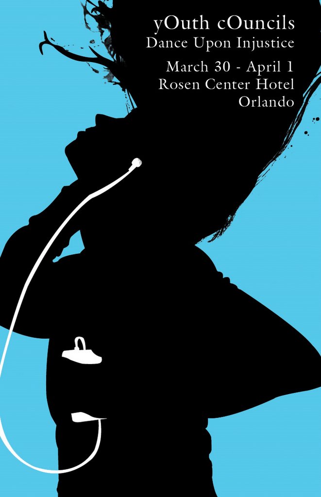
 Heres more stuff from work. These are posters for an upcoming youth conference. They want to go with the whole iPod look... exactly. And it turns out that I won't be doing the t-shirt for this conference, they actually sent me the images, so I told them I wasn't going to use them for the poster, that I'd make something better. Umm, I'm not sure if they want the actual iPod in there, so I just blocked it in, so yes there are some pointy spots... I know.
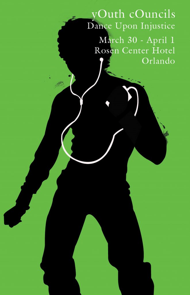
5 comments:
I really like how they turn out. But I do have a question can they get in trouble by having the I pod in there because it look like an adivatment for an Ipod?
Yeah you guys definitely can't include the iPod, and even the headphones are way too iconic for you to run with. The silhouette figures is fine, just don't go with the digital music player thing, that's some dangerous territory.
That last one was me; I just wanted to add that if they want you to go EXACTLY along the iPod route, Apple uses the font "Lucida Grande" in all its branding. If you don't have access to it (I doubt you do since you're using a PC), then you should at the least go with a sans-serif font, something with a nice weight to it and a sizable but not exaggerated x-height. I'm a big fan of Gill Sans personally, but I don't know what you have access to at work. Good luck and Godspeed, captain!
uhh... Jeremy... These aren't Vikings. Hey wait, maybe you could put Viking silhouettes with ipods, YEAH!!
Post a Comment