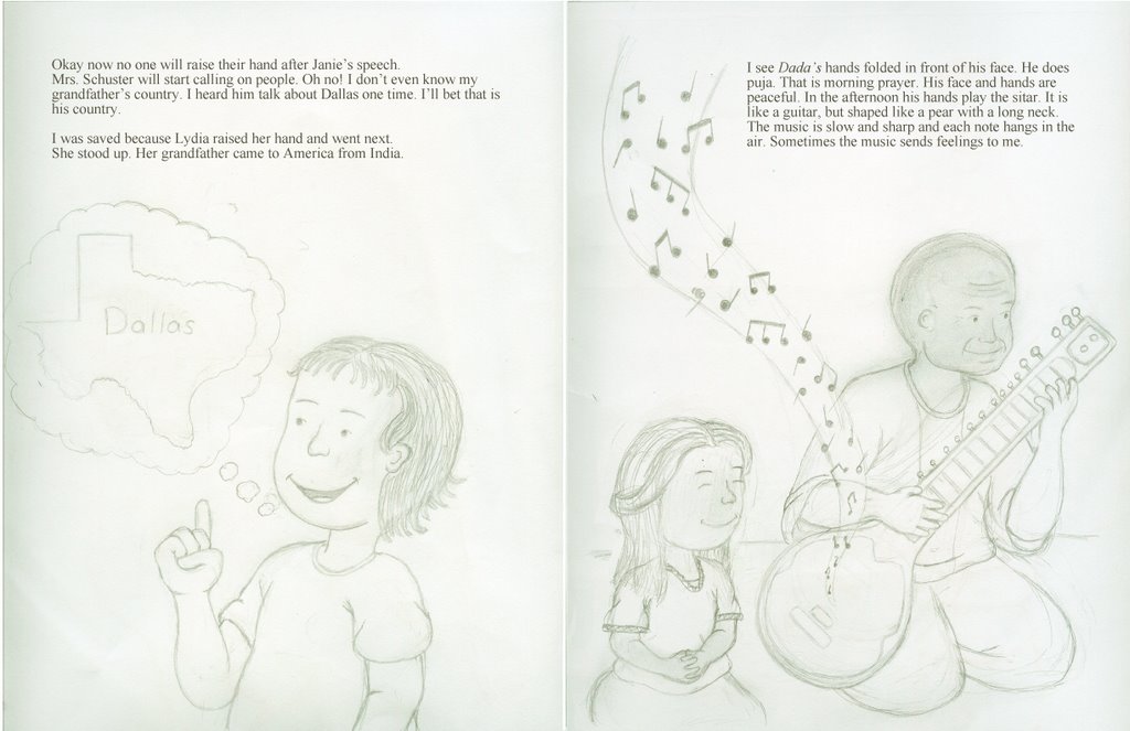
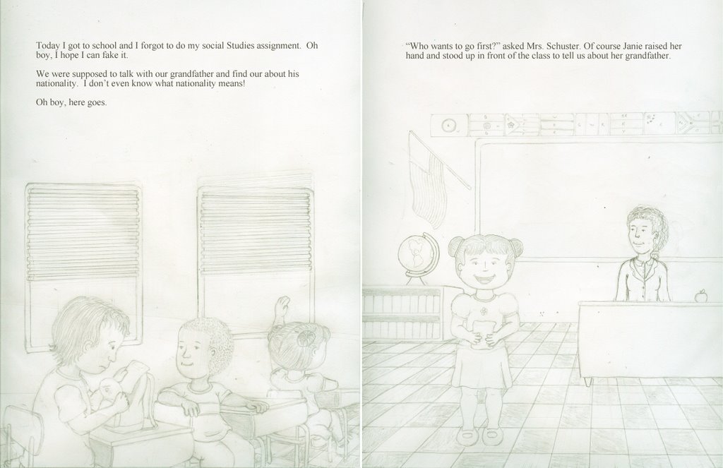
It's excellent to see you giving a go at perspective; the kids at their desks looks particularly great. However, and this is gonna sound weird, but the perspective on the floor tiling of the right page of the second image, it's too.. precise.
You're beginning to grasp perspective, which is great, but eventually you'll reach a sort of innate understanding where you don't have to do it by rays projecting from a vanishing point. When this happens, you'll begin doing a sort of stylized perspective that meshes with the style you have for your characters. It's not "innaccurate" per se, it's just that rigid perspective is too precise to use with stylized characters such as your own. You should also consider scale and planar position (foreground, middleground, background) to make your illustrations more dynamic.
Take a good look at some children's books for ideas of what I mean. Jimmy Pickering is awesome for his distorted perspective, use of planes, and his great use of textures. http://www.kidshannon.com/artists/index.cfm?artist_name=jimmypickering&talent_name=&style_name=&jump_to=

2 comments:
It's excellent to see you giving a go at perspective; the kids at their desks looks particularly great. However, and this is gonna sound weird, but the perspective on the floor tiling of the right page of the second image, it's too.. precise.
You're beginning to grasp perspective, which is great, but eventually you'll reach a sort of innate understanding where you don't have to do it by rays projecting from a vanishing point. When this happens, you'll begin doing a sort of stylized perspective that meshes with the style you have for your characters. It's not "innaccurate" per se, it's just that rigid perspective is too precise to use with stylized characters such as your own. You should also consider scale and planar position (foreground, middleground, background) to make your illustrations more dynamic.
Take a good look at some children's books for ideas of what I mean. Jimmy Pickering is awesome for his distorted perspective, use of planes, and his great use of textures.
http://www.kidshannon.com/artists/index.cfm?artist_name=jimmypickering&talent_name=&style_name=&jump_to=
Thank jason for showing me those websites they really great. :-D
Post a Comment